

If you are a Bright Spring, you may have felt this before. You try on a color that looks great in the store, but when you wear it, something feels off. Your face looks dull, your skin looks tired, and your features don’t stand out the way they should. Many people think the problem is their style, but in most cases, it is the color itself.
From experience, this is one of the most common struggles with Bright Spring types. People often choose colors that seem right, but those shades are too muted, too cool, or too heavy for their natural brightness. Bright Spring is all about clear, warm, and fresh colors. So even small mistakes can change how you look. In this guide, you will learn which colors to avoid, why they fail, and what to wear instead so you look fresher and more alive.
What Makes Bright Spring Unique
Bright Spring has three key traits:
- warm undertone
- high brightness
- clear and fresh colors
Because of this, your best colors are:
- vivid
- warm
- clean (not dusty or muted)
So when a color goes against these traits, it creates problems.
Why Some Colors Make You Look Dull
Before we list the worst colors, you need to understand why they fail.
A color usually looks bad on you if it is:
1. Too muted
Muted colors look dusty or soft. So they remove the natural glow from your face.
2. Too cool
Cool tones clash with your warm undertone. Because of this, your skin can look grey or flat.
3. Too dark or heavy
Very dark or muddy shades can overpower your features. As a result, your face can look heavy.
Why Colors Fail on Bright Spring
| Color Type | Effect on Face |
|---|---|
| Muted | Makes skin look dull and flat |
| Cool | Makes skin look grey or tired |
| Dark | Overpowers facial features |
Why Some “Spring Colors” Still Don’t Work
This confuses many people.
You may wear a “spring color” and still feel something is wrong.
Here’s why.
Not all spring colors are right for Bright Spring. Some are:
- too soft
- too light
- too muted
For example:
- soft peach ❌ (too muted)
- dusty coral ❌ (not clear enough)
Even though they are warm, they lack brightness.
Bright Spring needs colors that are:
- clear
- vivid
- fresh
So if a color looks faded, it will not suit you.
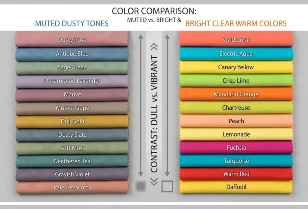
Worst Colors for Bright Spring
Let’s break this down into clear groups.
1. Muted and Dusty Colors
These are some of the worst colors.
Examples:
- dusty rose
- mauve
- sage green
- soft olive
- muted teal
Why don’t they work
These colors lack brightness. So they make your skin look dull and lifeless.
What to wear instead
- coral
- peach
- bright turquoise
- fresh green
2. Cool-Toned Colors
Bright Spring needs warmth. However, cool shades create an imbalance.
Examples:
- icy blue
- cool grey
- blue-based pink
- lavender
Why don’t they work
They fight against your natural warmth. Because of this, your face can look pale or tired.
What to wear instead
- warm aqua
- golden yellow
- warm pink
- light coral
3. Dark and Heavy Colors
Some dark colors are too strong for Bright Spring, especially when they are cool or muted.
Examples:
- black
- charcoal
- muddy burgundy
- dark plum
Why don’t they work
They overpower your natural brightness. As a result, your features can disappear.
What to wear instead
- warm navy
- deep teal
- chocolate brown
- clear warm red
4. Soft and Washed-Out Pastels
Many people think all light colors work for spring. But that is not true.
Examples:
- baby pink
- powder blue
- soft lilac
Why don’t they work
They are too soft and washed out. So they remove contrast from your face.
What to wear instead
- bright peach
- clear sky blue
- light but vivid yellow
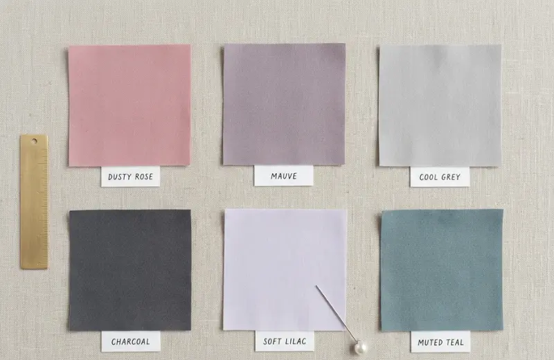
Worst Neutral Colors for Bright Spring
Neutrals can be tricky for Bright Spring.
Some neutrals look safe, but they actually make your face look dull.
Avoid these neutrals:
- black
- charcoal
- cool grey
- cool taupe
Why don’t they work
These colors are too cool or too heavy. So they reduce your natural brightness and warmth.
Better neutral options:
- warm beige
- camel
- light warm brown
- warm navy
These keep your look fresh and balanced.
Bright Spring Color Swaps
If a color makes you look dull, switch it with a brighter and warmer option from this table.
| Avoid This ❌ | Wear This Instead ✅ |
|---|---|
| Dusty rose | Clear coral |
| Mauve | Warm pink |
| Cool grey | Warm beige |
| Black | Warm navy |
| Charcoal | Chocolate brown |
| Powder blue | Clear sky blue |
| Soft lilac | Bright peach |
| Muted teal | Bright turquoise |

Quick Test: Is This Color Wrong for You?
Use this simple test.
If you wear a color and notice:
- Your skin looks grey
- Your face looks flat
- Your eyes lose brightness
Then the color is not right for you.
On the other hand, good colors will:
- make your skin look clear
- add brightness to your face
- make your eyes stand out
Bright Spring Color Checklist
Use this quick checklist before choosing a color.
Ask yourself:
- Is the color warm?
- Is it bright and clear?
- Does it look fresh, not dusty?
If the answer is yes to all, it will likely suit you. You can also explore the best colors for Bright Spring to make better choices.
But if even one answer is no, the color may not work.
Is This Color Right for Bright Spring?
| Question | Yes | No |
|---|---|---|
| Is it warm? | ✅ Good | ❌ Avoid |
| Is it bright and clear? | ✅ Good | ❌ Avoid |
| Does it look fresh (not dusty)? | ✅ Good | ❌ Avoid |
| Does it make your face look alive? | ✅ Perfect | ❌ Wrong color |
Common Mistakes Bright Springs Makes
Many Bright Springs get confused. So they often make these mistakes:
- choosing pastel instead of bright
- wearing cool tones because they look trendy
- picking black as a safe option
- choosing muted “neutral” colors
Because of these mistakes, the overall look becomes dull.
Can Bright Spring Wear Black?
This is a common question.
Black is usually too harsh for most Bright Springs. So it creates too much contrast and removes warmth.
A better option is:
- warm navy
- dark brown
These still look strong, but more balanced.
Can Bright Spring Wear Grey?
Most greys are too cool and muted. Because of this, they can make your skin look dull.
Better options:
- warm beige
- camel
- light warm taupe
Bright Spring vs Bright Winter (Common Confusion)
This is where many people go wrong.
Bright Winter can wear:
- cool tones
- icy colors
- black
However, Bright Spring cannot.
So if a color feels too cool or sharp, it likely belongs to Bright Winter.
Outfit Examples: What Works vs What Fails
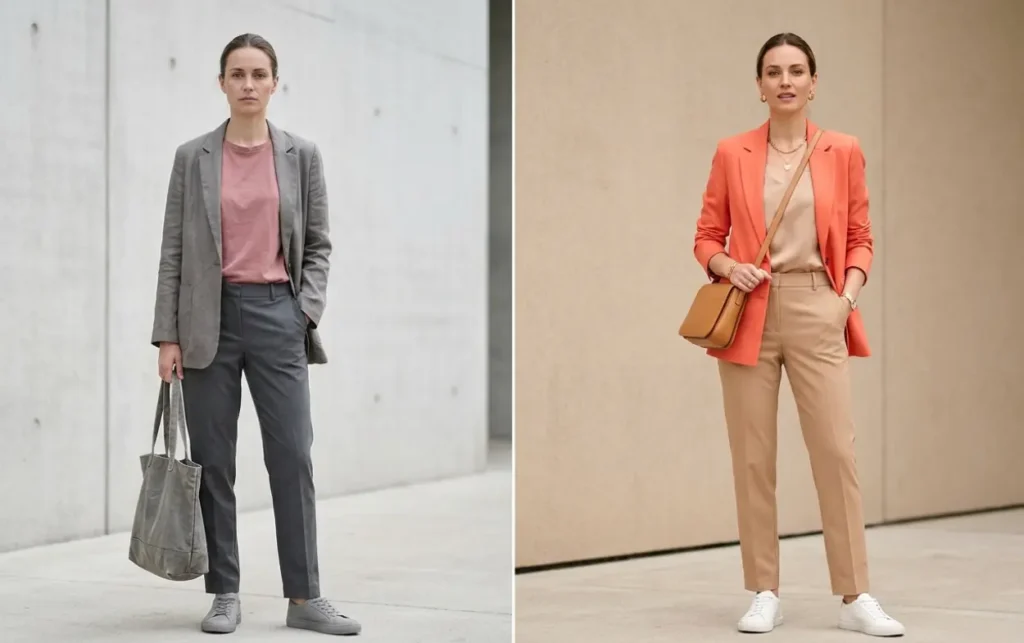
Example 1
Muted outfit:
- dusty pink top + grey pants
Result:
- Face looks dull
Better version:
- coral top + warm beige pants
Example 2
Dark outfit:
- black dress
Result:
- looks heavy
Better version:
- bright red or warm navy dress
Jewelry Mistakes to Avoid
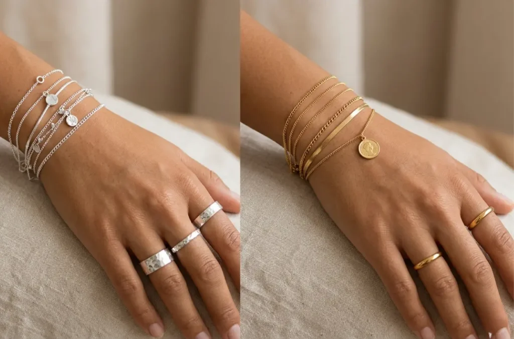
Jewelry also affects your overall look.
Avoid:
- silver
- white gold (cool tone)
These can look too cool against your skin.
Choose instead:
- yellow gold
- warm-toned metals
They match your natural warmth and make your skin glow.
Makeup Mistakes to Avoid
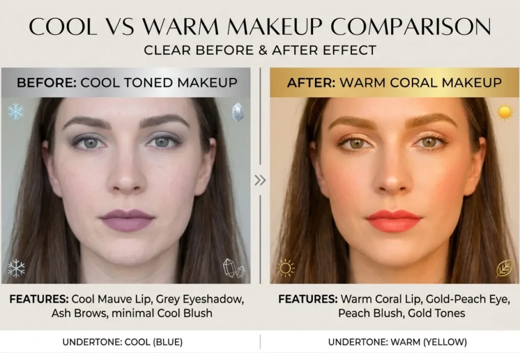
Your makeup should follow the same rules.
Avoid:
- dusty lipstick
- cool pink blush
- grey-toned eyeshadow
Choose:
- coral lipstick
- peach blush
- warm gold or bronze eyeshadow
Hair Color Mistakes
Hair color also matters.
Avoid:
- ashy brown
- cool black
Better choices:
- warm brown
- golden highlights
Why Some Colors Look Good in Store but Not on You
You may have noticed this before.
A color looks great on the hanger. But when you wear it, something feels off.
This happens because:
- Store lighting is different
- The color does not match your skin tone
Muted or cool colors can look nice on their own. But on Bright Spring, they remove brightness from your face.
So if a color makes your skin look dull in natural light, it is not the right choice.
- Avoid colors that are muted, cool, or too dark
- Choose colors that are bright, warm, and clear
- If a color makes your skin look dull, skip it
- Warm, vivid shades will always work better
CONCLUSION
From what I have seen, most Bright Springs are not choosing the wrong colors on purpose. They are picking shades that look good on their own but do not match their natural brightness. Once you switch to clear, warm colors, the difference is easy to notice. Your skin looks healthier, your eyes stand out more, and your overall look feels fresher. So keep it simple. Avoid dull, cool, or heavy colors, and choose bright, warm, and clear shades. When your colors match your natural tone, everything works better, and you feel more confident without extra effort.
