

I’ve seen how clothing colors can completely affect how someone looks. Some shades can make you appear tired or washed out, while others instantly brighten your face. There’s always a reason this happens, and it comes back to color theory for personal style and how different tones interact with your natural features.
In personal styling, wearing the wrong colors can leave you looking unwell or simply off, even if your outfit is expensive. That’s why building a wardrobe that helps you feel confident matters. The key is finding shades that flatter you most, and this is where color analysis becomes a helpful tool.
Color Theory Concept in Personal Style
Color theory plays a major role in fashion because the colors you wear can enhance features like brighter eyes and healthier-looking skin. When your shades match your natural coloring, you look more polished and put together.
One of the most important ideas in color theory is undertone. Undertone is the subtle color beneath your skin that affects how clothing shades look on you. Most colors can be described as warm, cool, or neutral. Warm colors often include yellow, orange, and red tones, while cool colors lean more toward blue and green.
1) Warm Undertones vs Cool Undertones
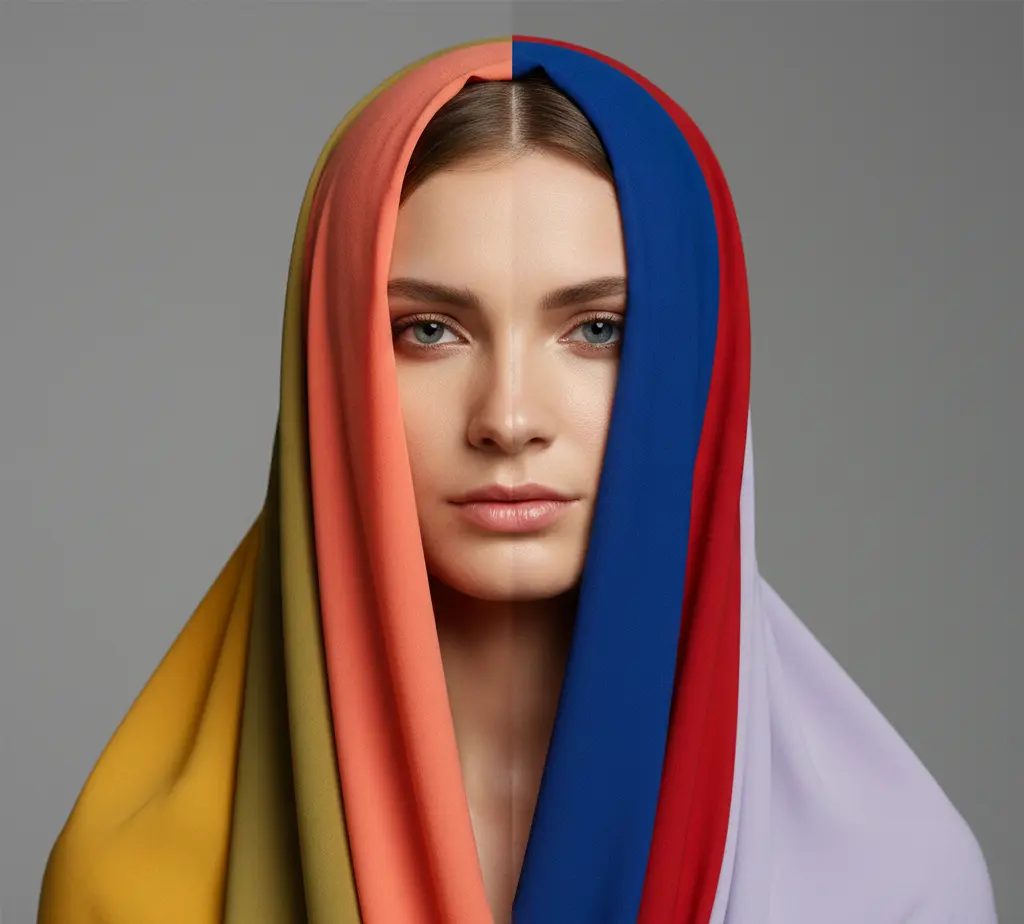
Warm and cool tones can exist within almost any color family.
Warm Undertones: People with warm undertones often have a golden or peachy base under the skin. They usually look best in shades that feel earthy and sunlit, such as:
- Mustard yellow
- Coral
- Olive green
- Warm browns
- Cream instead of bright white
These warmer colors tend to lift golden undertones and create a healthier, glowing look.
Cool Undertones: Cool undertones often have a pink, reddish, or bluish base. These tones tend to shine in crisp, jewel-like colors, such as:
- Sapphire blue
- Cherry red
- Icy lavender
- Emerald green
- Charcoal or navy neutrals
Cool-toned shades often make the skin look clearer and bring out brightness in the eyes.
Quick Undertone Test:
- If gold jewelry makes you glow, you may lean warm
- If silver jewelry brightens your face, you may lean cool
This simple test helps you avoid clothing colors that feel off and makes shopping much easier.
2) Identify Your Depth (Light, Medium, or Deep)
Depth is about how light or deep your natural coloring is. Matching clothing depth creates balance and harmony.
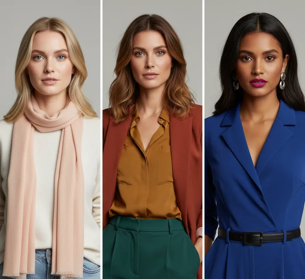
- Light depth: People with fair skin, light eyes, and blonde or light brown hair often suit softer, lighter shades.
- Medium depth: Medium skin tones and medium brown or red hair can handle an even mix of light and dark colors.
- Deep depth: Dark hair, deep skin tones, or strong natural contrast often look best in richer, bolder shades.
Checking your natural contrast before shopping can help you avoid colors that feel too pale or too heavy.
My pro tip is to check your natural contrast before shopping so you stop wasting money on the wrong depth
3) Bright or Soft? (Chroma Test)
Chroma describes how bright or muted a color appears. Highly saturated colors look clear and bold, while muted colors contain more grey and feel softer.
- Bright chroma: If strong shades like emerald, royal blue, and bright red make you shine, you may suit higher saturation, and you become bright chroma.
- Soft chroma: If dusty shades like taupe, soft sage, and muted rose look better, you may suit more blended tones, and become muted chroma.
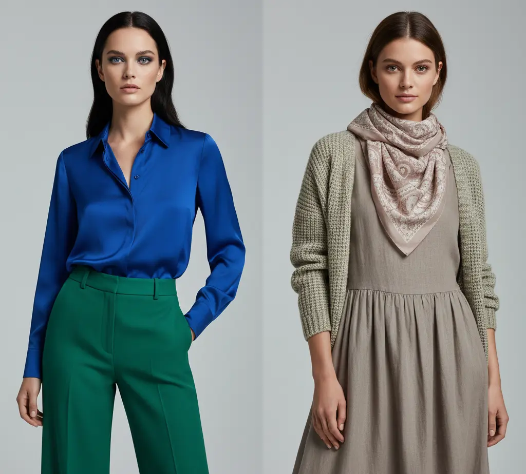
Try holding neon versus muted colors near your face. If neon overwhelms you, softer chroma may work best.
Quick Color Theory Takeaway
- Undertone = warm, cool, or neutral
- Depth = light, medium, or deep natural coloring
- Chroma = bright and clear vs soft and muted shades
- The best clothing colors match your natural features and create harmony
Building a Simple Everyday Wardrobe Palette
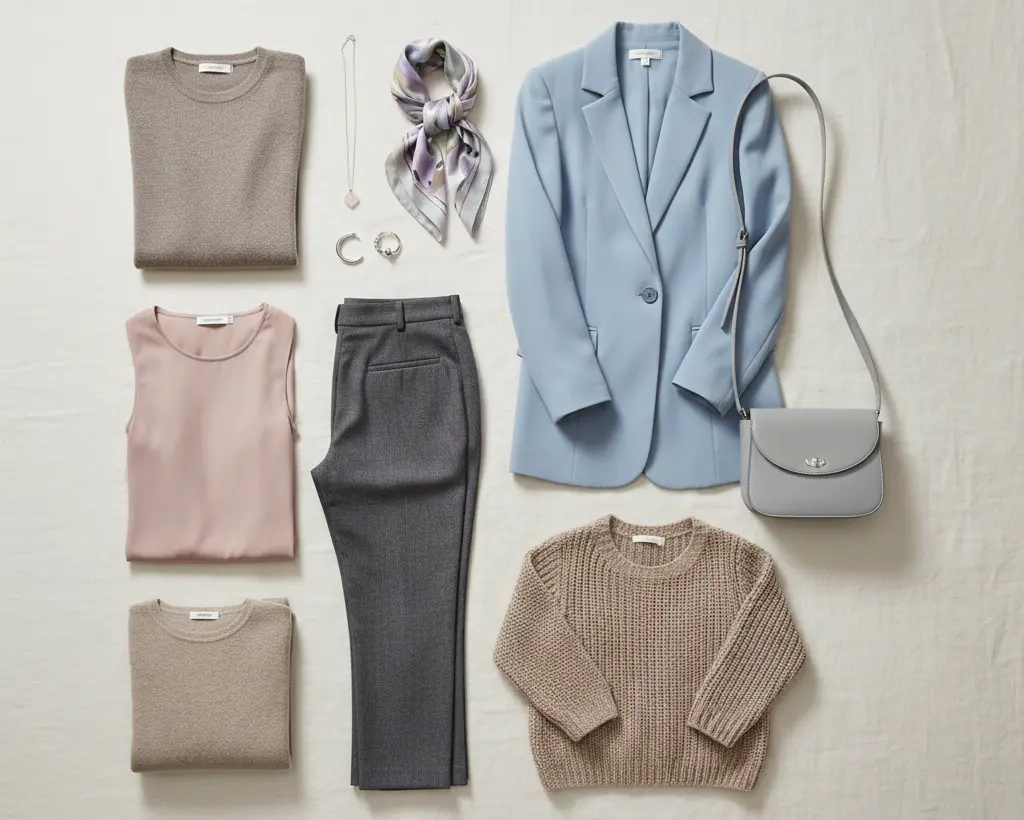
Once you understand your undertone, depth, and chroma, building a reliable wardrobe palette becomes much easier. Choose a few core neutrals and accent colors that naturally flatter you.
Warm undertones often suit earthy neutrals like cream and olive, while cool undertones may look better in shades like navy or charcoal. When your closet colors work together, getting dressed becomes simpler and more consistent.
Simple Wardrobe Palette Guide
| Undertone Type | Best Neutrals | Best Accent Colors |
|---|---|---|
| Warm | Cream, Camel, Olive | Coral, Mustard, Terracotta |
| Cool | Navy, Charcoal, Grey | Sapphire, Cherry Red, Icy Lavender |
| Neutral | Soft White, Taupe, Balanced Beige | Teal, Rose, Medium Green |
Personal Style Guide: Using Color Combinations
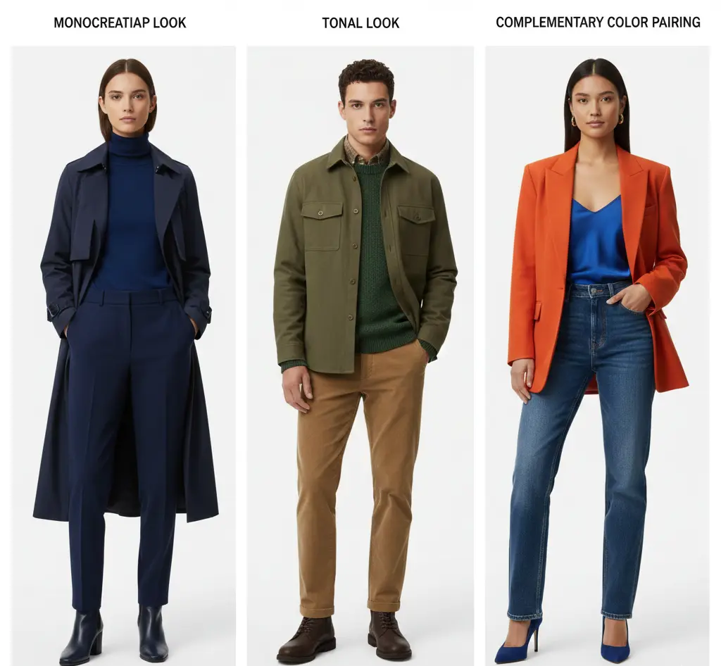
In personal styling, color theory helps you create balanced outfits through simple combinations.
1) Monochromatic Outfits
Monochromatic dressing uses one main color from head to toe. This can look clean and modern, and it often makes the body appear longer and more streamlined. It works especially well when you pair matching pieces like a knit top, trousers, and even shoes in the same shade for a smooth, unbroken effect.
- Creates an elongated look
- Feels simple yet polished
- Works with both minimal and bold styles
2) Tonal Dressing
Tonal outfits stay within one color family but use different shades, like lavender, purple, and eggplant. Mixing textures like knits, denim, and silk adds depth. This keeps the one-color look soft, adds dimension, and helps the outfit feel more interesting without losing harmony.
- Uses variation in tones
- Adds richness through fabric texture
- Great for balanced, blended styling
3) How Color Theory Works With Patterns and Prints
Patterns can feel tricky because they combine multiple shades. The most flattering prints usually follow the same chroma and depth rules. Softer coloring tends to suit muted, blended prints, while brighter coloring can handle bold contrast.
4) Complementary and Analogous Colors
Complementary colors sit opposite each other on the color wheel, making both shades appear stronger together. Examples include navy with rust or deep purple with mustard.
Analogous colors sit next to each other, like greens and blues, creating softer combinations.
Some pairings can be harder to wear, depending on your undertone and contrast, so it helps to test them near your face.
Color Pairing Cheat Sheet
- Monochromatic: One color head-to-toe for a clean, elongated look
- Tonal: Different shades of the same color family for soft dimension
- Complementary: Opposite colors (like navy + rust) for bold contrast
- Analogous: Neighbor colors (like blue + green) for blended harmony
When Colors Don’t Work for You (Washed Out vs Glowing)
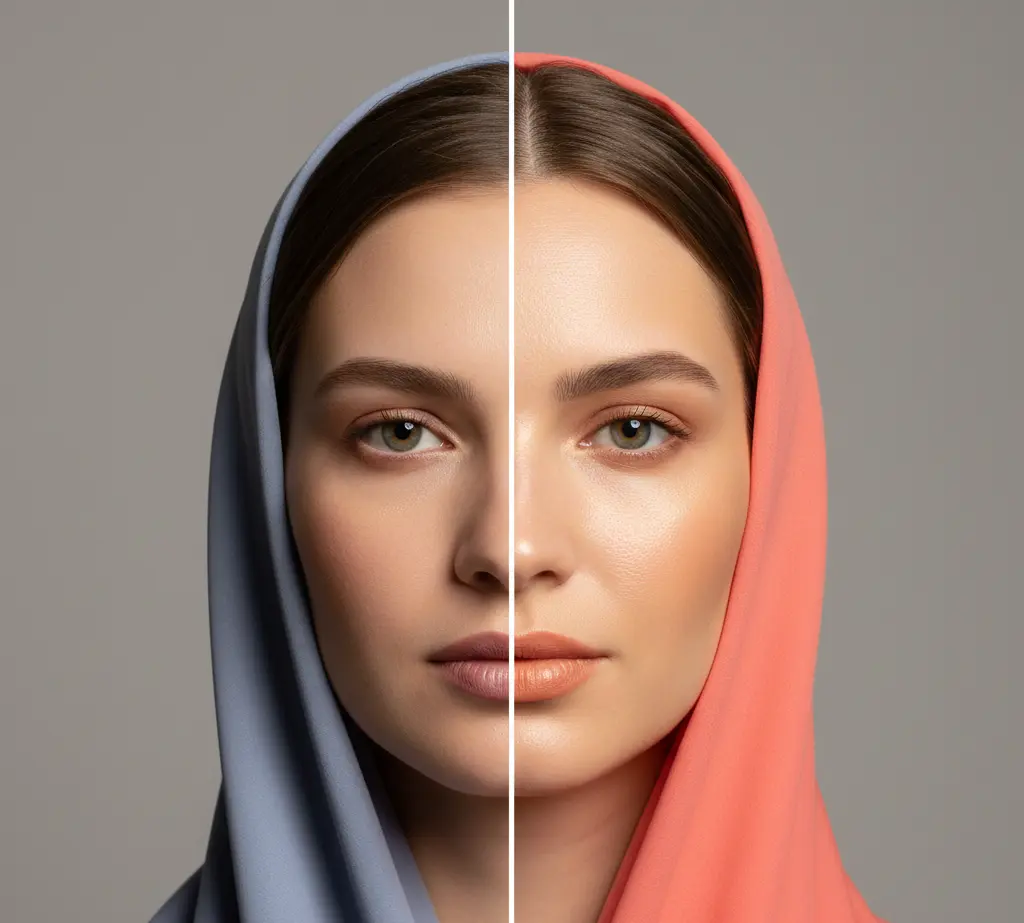
Wearing shades that clash with your undertone, depth, or chroma can make your skin look dull and tired, and may emphasize dark circles or uneven tones. Wrong colors can even make features seem washed out, while the right shades bring back a healthier, brighter natural glow.
- Can highlight fine lines and discoloration
- Makes the face look drained or off
- Best colors create effortless coordination and harmony
How Colors Affect Appearance
The right shade can bring your whole face to life. It enhances your skin, eyes, and hair, and it can reduce the appearance of fine lines and discoloration.
Some colors look amazing because they share the same color qualities as your natural features. Others feel neutral and work reasonably well on most people, while certain shades may look harsh or draining when they conflict with your coloring.
Seasonal color analysis is one way to group these traits, based on undertone, depth, hue, and chroma.
Not Sure Which Color Season You Are?
Take our free 2-minute Color Season Quiz to discover whether you are most likely a Spring, Summer, Autumn, or Winter—and explore the colors that suit you best.
Conclusion
Color theory for personal style shows that dressing well isn’t about having more clothes. It’s about choosing shades that bring out your natural features, like brighter eyes and healthier-looking skin. Once you understand undertone, depth, and chroma, shopping becomes much easier because you stop buying colors that feel off.
When your wardrobe is built around flattering tones, outfits start to feel effortless and balanced. The right colors create harmony, helping you look more confident and put together every day.
