

Have you ever bought a shirt that looked perfect in the store but strange once you wore it? Many people with Soft Summer coloring experience this problem. A bright top may look beautiful on the hanger, yet when worn, it can make the face look tired, dull, or washed out. This often leaves people confused because they are not sure why certain colors work while others do not.
After studying seasonal color analysis guides and observing many Soft Summer examples, a clear pattern appears. Soft Summer coloring is naturally cool, muted, and gentle. When colors are too bright, too warm, or too dark, they overpower these soft features. Understanding which colors to avoid makes it much easier to choose clothing that looks balanced and flattering.
Why Some Colors Look Bad on Soft Summer
Soft Summer features are usually cool and muted.
Typical traits include:
- soft brown, grey, or blue eyes
- ash brown or cool blonde hair
- neutral-cool skin tone
- low contrast between hair, skin, and eyes
Because of this softness, very strong colors create too much contrast.
Bright colors pull attention away from the face. Warm shades clash with the cool undertone. Very dark colors look heavy.
Soft Summer looks best in colors that feel calm and blended.
Quick Soft Summer Color Checklist
If you are unsure about a color while shopping, this simple checklist can help.
| Feature | What to Look For |
|---|---|
| Undertone | Cool or neutral |
| Intensity | Soft and slightly muted |
| Contrast | Low to medium |
| Overall feel | Calm and blended |
Colors that are very bright, very warm, or extremely dark usually overpower Soft Summer features. When a color looks slightly dusty or toned down rather than bold and vivid, it is often a better match for this season.
Worst Colors for Soft Summer
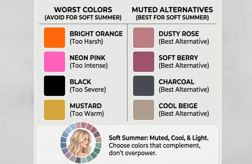
Some colors overpower Soft Summer features.
These colors are usually:
- very bright
- strongly warm
- extremely dark
- very high contrast
Below are the most common ones.
Bright Colors to Avoid
Bright colors contain a lot of intensity. They feel clear and vivid.
Soft Summer coloring is muted, so these shades often look harsh.
Examples include:
- bright orange
- neon yellow
- electric blue
- neon pink
- bright red
These shades draw attention away from the face.
Better options are softer versions such as dusty rose, muted berry, or soft blue.
Warm Colors to Avoid
Soft Summer is a cool season. Warm shades usually contain yellow or golden undertones.
These tones often clash with Soft Summer skin.
Examples include:
- mustard yellow
- warm coral
- pumpkin orange
- rust
- golden brown
Instead, choose cooler versions like mauve, cool rose, or soft plum.
Harsh Neutrals
Neutrals are important in a wardrobe, but some of them are too strong.
Pure black and pure white create strong contrast. This contrast can make Soft Summer features look flat.
Neutrals to avoid include:
- pure black
- stark white
- very dark espresso brown
Better choices are softer neutrals such as:
- charcoal
- soft navy
- cool taupe
- dusty grey
Extremely Dark Shades
Very deep colors can overwhelm Soft Summer coloring.
These shades create heavy contrast with the face.
Examples include:
- jet black
- deep burgundy
- dark chocolate brown
Instead choose medium or soft shades like muted berry or dusty navy.
Quick Color Swap Guide
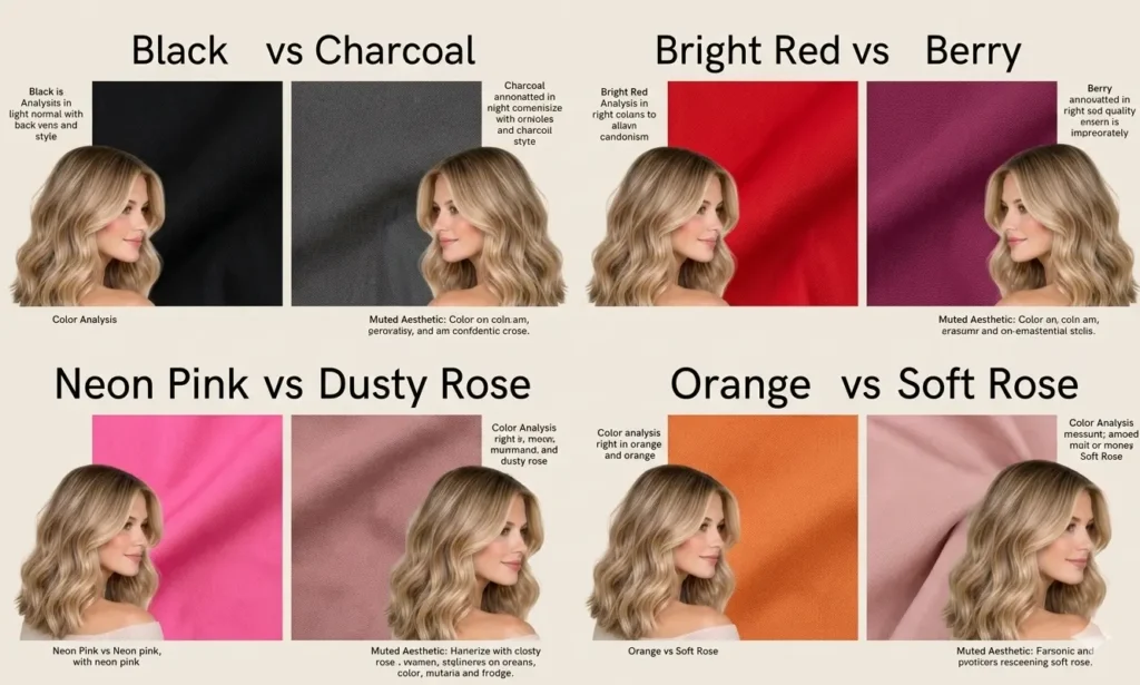
Many Soft Summers find it helpful to replace strong colors with softer ones.
Here are simple swaps that work well.
| Avoid | Try Instead |
|---|---|
| black | charcoal |
| bright red | soft berry |
| neon pink | dusty rose |
| orange | soft rose |
| mustard | cool beige |
These small changes can make outfits look more balanced.
Soft Summer coloring looks softer and cooler than bright palettes. Because of this, bold colors often draw attention away from the face.
For example, bright red can look very strong, while soft berry blends more naturally with Soft Summer features. The same happens with black and charcoal. Charcoal still looks dark, but it feels softer and less harsh.
A simple trick while shopping is to look for colors that appear slightly muted or dusty rather than bright and clear. These tones usually work better for Soft Summer.
Soft Summer Color Palette
The Soft Summer palette contains cool and muted colors. Most shades have a soft grey influence.
Common palette colors include:
- dusty rose
- lavender
- muted teal
- soft navy
- mauve
- cool grey
These colors match the natural softness of Soft Summer features.
They support the face rather than overpowering it.
Soft Summer Neutrals
Neutrals help create a balanced wardrobe.
Soft Summer neutrals usually look calm and slightly grey.
Examples include:
- charcoal
- soft navy
- cool taupe
- mushroom grey
- muted blue grey
These shades pair well with many Soft Summer colors.
Color Combinations for Soft Summer
Soft Summer outfits work best when the colors stay gentle and balanced.
Good combinations include:
- dusty rose with cool grey
- soft navy with lavender
- muted teal with charcoal
- mauve with blue grey
Avoid mixing very bright colors with muted tones. The bright shade will dominate the outfit.
Patterns and Prints
Some prints can overpower Soft Summer coloring.
Patterns to avoid include:
- very bold tropical prints
- high contrast black and white patterns
- neon color blocks
Better options include:
- watercolor prints
- soft floral patterns
- low contrast textures
These patterns keep the overall look soft and balanced.
Metals and Jewelry
Jewelry also affects how colors appear.
Soft Summer usually looks better in cooler metals.
Good choices include:
- silver
- white gold
- platinum
- soft rose gold
Very bright yellow gold may look too warm, but softer gold tones can still work.
Hair Colors Soft Summer Should Avoid
Hair color also affects how clothing colors look on Soft Summer.
Very warm or very dark hair shades can create too much contrast with the natural softness of this season.
Hair colors Soft Summer should usually avoid include:
- copper
- golden blonde
- warm caramel
- bright auburn
- jet black
These shades contain strong warmth or depth.
Better hair color options include:
- ash brown
- cool medium brown
- soft espresso
- cool beige blonde
These tones keep the overall look balanced.
Makeup Colors Soft Summer Should Avoid
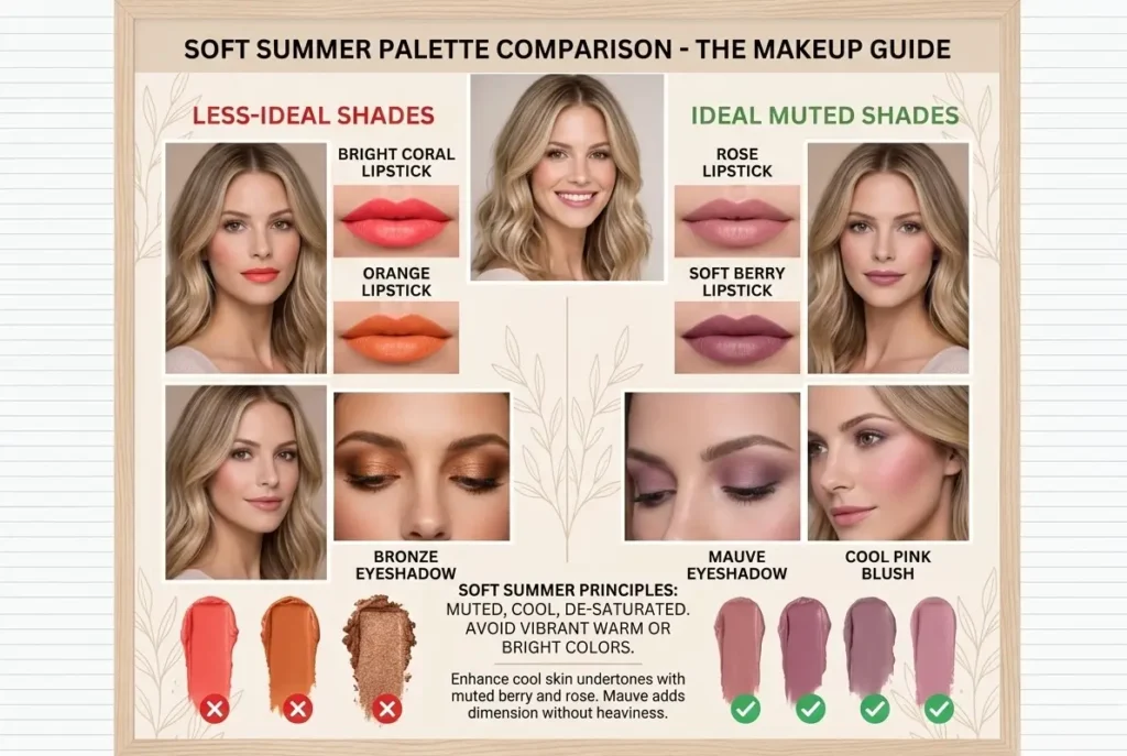
Makeup colors follow the same rule as clothing colors.
Soft Summer features look best with cool and muted tones.
Makeup colors Soft Summer should avoid include:
- orange lipstick
- bright coral lipstick
- warm bronze eyeshadow
- neon pink blush
- very dark black eyeliner
Better makeup choices include:
- rose lipstick
- soft berry lipstick
- cool pink blush
- mauve eyeshadow
- charcoal eyeliner
These colors blend better with Soft Summer coloring.
Sister Seasons of Soft Summer
In seasonal color analysis, every season has nearby palettes called sister seasons.
Soft Summer sits between two other seasons:
- True Summer
- Soft Autumn
Soft Summer shares cool undertones with True Summer. It also shares muted softness with Soft Autumn.
Because of this position, Soft Summer needs colors that are both cool and slightly muted.
Very warm colors and very bright colors often look unbalanced on Soft Summer.
Understanding Soft Summer Color Dimensions
Each seasonal palette is defined by three color qualities.
These qualities explain why some colors work while others do not.
Hue
Soft Summer colors have a cool undertone. Shades with strong yellow or golden warmth usually look less balanced.
Value
The palette mostly sits in the middle range. Extremely light or extremely dark colors can overpower Soft Summer features.
Chroma
Soft Summer colors are muted. They contain a soft grey influence that reduces brightness.
Bright and intense colors usually look too strong for this season.
Soft Summer Celebrities
Looking at celebrity examples can help people understand the season better.
Examples often suggested by stylists include:
- Emily Blunt
- Kate Middleton
- Dakota Johnson
These celebrities are often seen wearing cool and muted shades that support their natural coloring.
Common Soft Summer Color Mistakes
Many Soft Summers repeat the same color mistakes.
These are the most common ones.
Wearing very bright colors
Bright shades overpower soft features.
Choosing warm tones
Warm shades clash with cool undertones.
Using pure black too often
Black can look too strong for this season.
Ignoring muted colors
Soft Summer looks best in dusty, gentle shades.
Conclusion
From many examples across seasonal color analysis guides and real outfit comparisons, one pattern appears again and again. Soft Summer coloring looks best in cool and muted shades, while bright, warm, and very dark colors often create harsh contrast. Small changes, such as replacing black with charcoal or bright red with soft berry, can make a noticeable difference. Once these color patterns become familiar, choosing flattering clothing becomes easier, and building a balanced wardrobe feels much more natural.
