

Many people struggle with color without knowing why. You buy a shirt that looks great on the hanger, but once you wear it, something feels off. Some shades make your face look tired. Others feel too loud. This happens to many readers who search about muted vs bright colors. They are trying to figure out why certain outfits work and others do not. The problem is rarely the style of clothing. It is usually the chroma of the color, which means how soft or how clear the color looks.
After working with color palettes and testing shades on real faces, one thing becomes clear. Most color mistakes happen because people do not know if they suit muted or bright colors. Many guides online explain color theory, but they do not help readers decide for themselves. This article focuses on simple tests, real life examples, and practical tips. It is based on methods used in personal color analysis and daily styling work. The goal is to help you see which type of color supports your natural features and makes getting dressed easier.
Quick Takeaway
Muted colors look soft and toned down. Bright colors look clear and bold.
- Choose muted if strong colors overpower your face.
- Choose bright if soft colors make you look dull.
- Test colors near a window in natural light.
- Your skin will show which works best.
Quick Answer: Are You Muted or Bright
You may suit muted colors if:
- bright shades look too loud on you
- dusty or soft colors look calm
- gentle makeup looks better
- strong colors overpower your face
You may suit bright colors if:
- clear colors make your skin glow
- soft tones look dull
- strong contrast looks natural
- bold lipstick works well
This quick check helps you decide fast.
What Is Chroma
Chroma tells us how clear or soft a color appears.
Bright colors look clean and strong.
Muted colors look soft and toned down.
A bright red looks bold.
A muted red looks calm.
This is the main idea behind bright vs soft colors.
Muted vs Bright Colors: The Main Difference
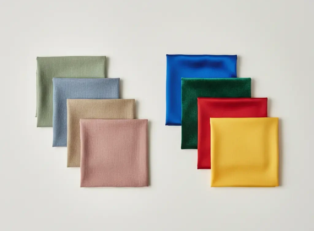
Muted colors
- soft
- low intensity
- toned with gray or mixed with other colors
- calm feeling
Bright colors
- clear
- high intensity
- pure pigment
- bold feeling
Both colors can look great. It depends on your features.
Muted vs Bright Colors at a Glance
| Feature | Muted Colors | Bright Colors |
|---|---|---|
| Look | Soft and blended | Clear and bold |
| Intensity | Low | High |
| Best for | Soft contrast features | Clear contrast features |
| Makeup | Blended makeup | Defined makeup |
| Overall feel | Calm and soft | Bold and lively |
Why This Matters for Your Style
Some people glow in soft tones.
Others look better in clear bold shades.
If you wear the wrong chroma, your face may look tired.
If you wear the right chroma, your skin looks fresh.
Knowing how these colors helps with:
- clothes
- makeup
- hair color
- accessories
How to Tell if You Suit Muted or Bright
Look at Your Natural Contrast
Stand in front of a mirror.
Check your hair, eyes, and skin.
High contrast example
dark hair and light skin
These people often handle clearer colors.
Low contrast example
soft hair and soft skin
These people often suit muted colors.
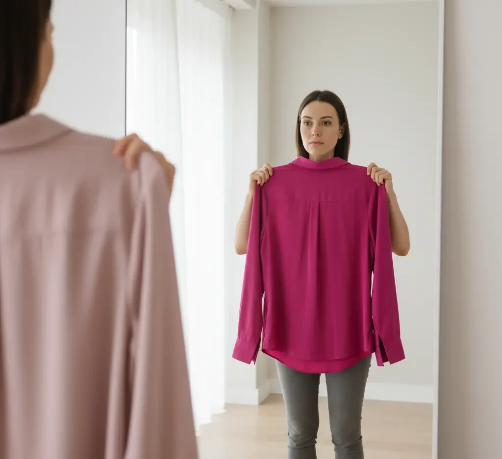
Try the Clothing Test
Hold a bright top near your face.
Then try a soft dusty top.
Watch your skin.
One will make you look healthy.
The other may wash you out.
Check Your Features
Muted types often have:
- soft eye color
- blended hair color
- gentle contrast
Bright types often have:
- clear eyes
- strong contrast
- sharper features
Quick Decision Guide
| If this happens | Try this |
|---|---|
| Bright colors make your face look tired | Try muted colors |
| Muted colors make your face look dull | Try bright colors |
| Your features look soft and blended | Lean muted |
| Your features look clear and sharp | Lean bright |
Step-by-Step Color Test at Home
Stand near a window in natural light.
Remove makeup if possible.
Step 1
Hold a bright color near your face.
Try bright pink or cobalt blue.
Step 2
Hold a muted version.
Try dusty rose or soft blue.
Step 3
Look at your skin and eyes.
Do they look fresh or tired?
If your face looks clearer in the bright shade, you lean bright.
If your face looks calmer in the soft shade, you lean muted.
Repeat with a few colors to confirm.
Brightness vs Contrast (Common Confusion)
Brightness and contrast are not the same.
Contrast
This is the difference between your hair, skin, and eyes.
Brightness
This is how clear or soft a color looks.
You can have high contrast and still suit medium brightness.
You can have low contrast and still wear some clear colors.
Check both before choosing.
Muted vs Bright in Seasonal Color Analysis
Muted seasons
- soft summer
- soft autumn
Bright seasons
- bright spring
- bright winter
If you belong to a soft season, muted colors suit you.
If you belong to a bright season, bold colors suit you.
Color Mood and Feeling
Muted colors often feel calm and relaxed.
They can look soft and refined.
Bright colors often feel lively and bold.
They can look fresh and energetic.
Some people choose colors based on mood as well as appearance.
Outfit Ideas
If You Suit Muted Colors
Choose:
- dusty blue
- sage green
- soft brown
- muted rose
Avoid very neon shades.
They can overpower your face.
If You Suit Bright Colors
Choose:
- clear red
- cobalt blue
- bright emerald
- crisp black and white
Avoid too many gray tones.
They may dull your look.
Real Life Outfit Examples
For daily wear
Muted types can try soft denim, sage tops, and warm gray.
Bright types can try clear white, bold blue, and strong red.
For work
Muted types suit dusty tones and soft neutrals.
Bright types suit clean contrast and clear shades.
For events
Muted types look great in soft jewel tones.
Bright types shine in clear jewel tones.
Makeup Tips
Muted types
- soft lipstick
- blended eyeshadow
- gentle blush
Bright types
- clear lipstick
- defined eyeliner
- strong contrast
Makeup should match your chroma level.
How to Shop for the Right Colors
In stores, check fabric tone.
Muted colors look slightly gray or softened.
Bright colors look clear and strong.
Store lighting can change color.
Check items near natural light if possible.
Texture matters.
Matte fabric softens color.
Shiny fabric makes color look brighter.
Prints matter too.
Soft blended prints suit muted types.
Clear sharp prints suit bright types.
Hold clothes near your face before buying.
If your skin looks better, it works.
Common Mistakes
Many people mix brightness with contrast.
They are different.
High contrast does not always mean bright.
Low contrast does not always mean muted.
Another mistake is wearing colors that are too dull.
Muted does not mean lifeless.
Muted still needs color.
Common Mistakes to Avoid
| Mistake | Better Approach |
|---|---|
| Thinking muted means boring | Muted still has color and depth |
| Thinking bright means neon | Bright can be clear and polished |
| Ignoring contrast level | Check your hair, skin, and eyes together |
| Testing colors only in store lighting | Always check in natural light |
Conclusion
After years of testing color palettes on different skin tones and contrast levels, one lesson stands out. The right chroma makes a big difference. When someone wears colors that match their natural softness or clarity, their face looks brighter and more even. When the chroma is wrong, the same person can look washed out or overpowered.
You do not need a huge wardrobe change to fix this. Start small. Test a few tops near your face in natural light. Notice which shades make your skin look calm and healthy. Over time, patterns become clear. Once you know if you suit muted or bright colors, shopping becomes easier. Outfit choices feel more natural. Makeup starts to match without effort.
Color should support your features, not compete with them. When you learn your chroma level, you stop guessing and start choosing with confidence.