

Many people struggle with color choices and do not know why. You might wear an outfit that looks great in the store but feels off once you try it on. You might pick colors for a post or design and still feel that something looks flat. This happens because most people focus on color names and ignore one key factor. That factor is value in color, which means how light or dark a color looks. When value is off, even good colors can feel wrong.
In my work with color guides and visual examples, I see this issue often. People think they need new colors, but they really need better value balance. Once they learn to spot light and dark first, things start to click. Outfits feel more balanced. Photos look clearer. Designs become easier to read. This guide will help you understand color value in a simple way and show how to use it in daily life with confidence.
Key Takeaways
- Value in color means how light or dark a color looks
- Good value creates contrast and balance
- Check value before choosing colors
- A black and white test shows value fast
- Matching value improves outfits and design
Why value in color matters
Value in color theory helps you see clearly.
It affects how things stand out.
It also changes how colors work together.
You notice value when:
- Text is hard to read on a page
- An outfit looks too strong or too dull
- A photo feels flat
- A design looks messy
Good value makes things easier to see.
Bad value makes things confusing.
Light vs dark colors
Light colors have high value.
Dark colors have low value.
Examples:
- White is very high value
- Black is very low value
- Light gray sits in the middle
- Navy is darker than sky blue
You can test value fast.
Turn an image black and white.
If one area looks lighter, it has higher value.
Value scale explained
A value scale shows steps from white to black.
Most scales use 5 to 10 steps.
White → light gray → gray → dark gray → black
This helps you compare colors.
Two colors can be different in name but close in value.
That is why some outfits look flat even with many colors.
Value Scale Example
White → Light gray → Mid gray → Dark gray → Black
Train your eye to see value
Many people see color first, and value second.
You can train your eye with simple steps.
- Look at photos in black and white
- Group colors into light, medium, dark
- Squint your eyes at objects
- Notice shadow and highlight
- Compare clothing against skin tone
Practice this often.
You will start to notice value faster.
Why people struggle to see value
Many people focus on color names.
They see red, green, or blue first.
They forget to check light and dark.
Bright colors can trick the eye.
Yellow may feel strong, but it can still be light in value.
Deep blue may feel calm, but it is dark in value.
Practice helps.
Look at objects in black and white photos.
Notice which parts look light and which look dark.
Value vs hue vs saturation
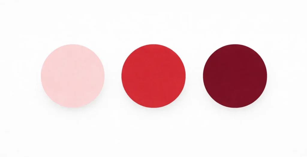
These three ideas often confuse readers.
Value = light or dark
Hue = color name
Saturation = strength of color
A light pink and deep red share the same hue family.
But their value is different.
Their saturation can also be different.
Knowing this helps you mix colors better.
Value vs Hue vs Saturation
| Element | Meaning | Example |
|---|---|---|
| Value | How light or dark a color looks | Light pink vs deep red |
| Hue | Color name | Red, blue, green |
| Saturation | Strength of color | Soft red vs bright red |
Quick comparison
Value = how light or dark a color looks
Hue = the color name
Saturation = how strong or soft a color looks
Example:
Light pink and deep red share the same hue family.
But their value is different.
Their saturation can also be different.
Knowing this helps you choose colors that work well together.
Value in clothing and personal style

Value in color affects personal style.
It also affects how a face stands out.
Some faces have high contrast.
Dark hair with light skin is one example.
These faces look good in strong value contrast.
Black and white outfits often work well.
Some faces have low contrast.
Soft hair and soft skin tones are one example.
These faces look better in gentle value shifts.
Beige and soft gray can look balanced.
If clothing value matches face value, the look feels calm.
If the gap is too big, the outfit may feel harsh.
High vs Low Value Contrast
| Contrast Type | Features | Works Best With |
|---|---|---|
| High value contrast | Dark hair and light skin | Black and white outfits |
| Low value contrast | Soft hair and soft skin | Beige, soft gray, gentle tones |
High vs low value contrast in faces

Faces also have value contrast.
High contrast face:
Dark hair and light skin
Looks good in strong light and dark outfits
Low contrast face:
Soft hair and soft skin tones
Looks better in gentle value shifts
You can test this in a mirror.
Wear a black and white outfit.
Then wear soft gray and beige.
Notice which one feels balanced.
Matching outfit value with natural contrast makes a big difference.
Value in design and branding
Designers use value to guide the eye.
Dark text on a light background is easy to read.
Light text on a light background is hard to read.
Logos also use value.
Strong value contrast makes logos clear.
Low contrast can make them fade away.
When building a website or post, check value first.
Make sure the main text stands out.
Value in photography
Photos depend on value.
Light and shadow create depth.
If all parts share the same value, the photo looks flat.
Try this:
Take a photo.
Change it to black and white.
Look at the light and dark areas.
If the subject blends into the background, adjust value.
Add light or dark contrast.
Easy ways to check value

Use these quick steps:
- Turn an image black and white
- Squint your eyes at colors
- Compare light and dark areas
- Check outfit against skin tone
- Look at text on a background
These steps work for art, design, and style.
Practice exercises
Try these quick exercises to better understand the value.
Exercise 1
Take a photo of your outfit.
Turn it black and white.
Check if your clothes blend into your face or stand out too much.
Exercise 2
Pick three colors.
Place them side by side.
Convert them to grayscale.
See which one is lighter or darker.
Exercise 3
Look at a room.
Find the lightest object.
Find the darkest object.
Notice how value guides your eye.
These exercises help you see value without confusion.
Common mistakes
Many people make these errors:
- Using colors with the same value
- Ignoring contrast
- Choosing outfits that overpower the face
- Using text that blends into the background
Fixing value often fixes the whole look.
Fast Value Check
- Turn the image black and white
- Compare light and dark areas
- Adjust colors until contrast feels balanced
Not Sure Which Color Season You Are?
Take our free 2-minute Color Season Quiz to discover whether you are most likely a Spring, Summer, Autumn, or Winter—and explore the colors that suit you best.
Final Thought
From working with color in style guides, visuals, and everyday examples, one pattern shows up again and again. Most people think they have a “color problem.” In truth, they have a value problem.
Once you start checking light and dark first, color choices get easier. You stop guessing. You start seeing. A quick black-and-white check can tell you more than a long search for the perfect shade. This small habit can improve outfits, photos, and design work.
If you feel that certain colors never look right on you or your layouts feel flat, do not rush to change the color family. Check the value first. That simple step often fixes the issue. With a bit of practice, you will spot value in color without effort and make better choices with confidence.
