

Many people see the word chroma while learning color theory and feel lost. The definition often sounds simple, yet the idea still feels unclear in real life. You may look at two shades of the same color and sense a difference, but you cannot explain why one feels bright and the other feels soft. This confusion is common. Most guides explain the term in a technical way and skip everyday examples. That leaves readers with a definition but no clear understanding.
In my work with color palettes, styling, and visual content, this question comes up often. People know color names. They know light and dark. But they struggle to see how color strength changes the mood of a color. Over time, I saw that the best way to explain chroma is through daily use. Clothing, paint, photos, and design all show this idea clearly. This guide is built from that hands-on experience. The aim is to help you see chroma in real objects so the concept feels clear and useful.
Chroma Quick Takeaway
- Chroma shows how strong or muted a color looks.
- High chroma colors look bold and clear.
- Low chroma colors look soft and muted.
- The same hue can have different chroma levels.
Tip: If a color looks dusty or gray, its chroma is lower. If it looks clear and bright, its chroma is higher.
Quick Answer
Chroma means how strong or muted a color looks.
High chroma colors look bold and clear.
Low chroma colors look soft and gray.
Hue tells what color it is.
Chroma tells how strong it looks.
This is the core idea of chroma in color theory.
Simple Definition
Chroma means the strength of a color.
It shows how pure a color looks.
High chroma means bold and clean color.
Low chroma means soft and gray color.
This is the easiest way to understand it.
Chroma vs Hue vs Saturation
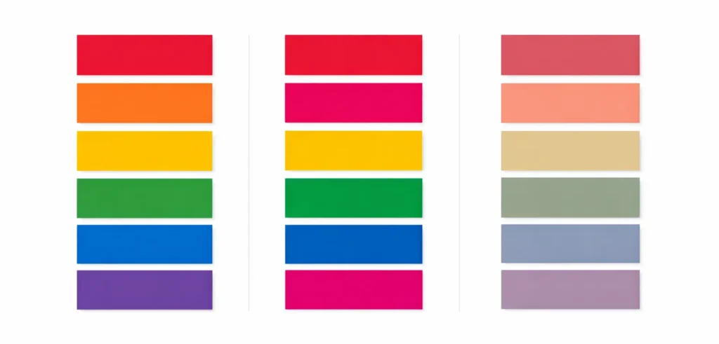
Many people mix these words.
Here is the difference.
Hue
Hue is the color name.
Red, blue, green, and yellow are hues.
Chroma
Chroma shows how strong or dull the hue looks.
Saturation
Saturation is close to chroma.
It also shows color strength.
Some color systems use chroma.
Some use saturation.
In simple terms:
Hue is what color it is.
Chroma is how strong it looks.
Hue, Chroma, and Saturation at a Glance
| Term | What it means |
|---|---|
| Hue | The color name, like red or blue |
| Chroma | How strong or muted the color looks |
| Saturation | Often used like chroma to show color strength |
Tip: Hue tells what color it is. Chroma tells how strong it looks.
How Chroma Changes With Gray
Chroma drops when gray is added to a color.
Chroma rises when gray is removed.
Example:
Pure red has high chroma.
Add gray to that red.
It becomes dusty red.
Now the chroma is lower.
This is why muted colors look soft.
They contain more gray.
This idea is used in paint, fashion, and design.
High Chroma Colors
High chroma colors look bright and clean.
Examples:
• bright red
• clear blue
• strong yellow
• neon green
These colors stand out fast.
They grab attention.
Designers use high chroma for bold looks.
Brands use it for logos and ads.
Low Chroma Colors
Low chroma colors look soft and muted.
Examples:
• dusty rose
• sage green
• muted blue
• soft brown
These colors feel calm.
They look gentle and relaxed.
Many home interiors use low chroma colors.
Fashion also uses them for soft outfits.
Same Hue, Different Chroma
Take one hue, like blue.
Bright royal blue has high chroma.
Dusty blue has low chroma.
Both are blue.
Only the chroma changes.
Designers often keep the same hue and adjust chroma.
This changes the mood of a color.
High chroma feels bold.
Low chroma feels calm.
Real Life Examples
In clothing
A bright orange shirt has high chroma.
A faded orange shirt has low chroma.
In makeup
Bold lipstick has high chroma.
Soft nude lipstick has low chroma.
In rooms
A bright red wall feels loud.
A muted red wall feels calm.
In photos
Editing can raise or lower chroma.
High chroma makes colors pop.
Low chroma makes photos soft.
Chroma in Paint and Interiors
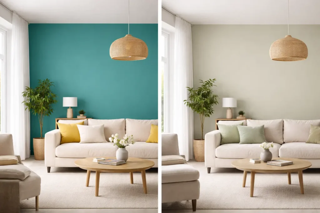
Chroma matters a lot in wall paint.
High chroma paint looks strong on walls.
It can feel loud in large spaces.
Low chroma paint feels softer.
It is easier to live with every day.
Many homes use low chroma colors like:
• soft green
• dusty blue
• warm gray
These feel calm and balanced.
Bright colors often work best as accents.
Muted colors work well for full rooms.
Why Chroma Matters
Chroma changes how a color feels.
High chroma feels:
• bold
• energetic
• strong
Low chroma feels:
• calm
• soft
• natural
This helps in art, design, fashion, and photos.
Chroma in Fashion and Style

Some people look better in bright colors.
Some look better in soft colors.
If bright colors suit you, you may suit high chroma.
If soft colors suit you, you may suit low chroma.
This idea is used in personal color analysis and styling.
Chroma in Art and Design
Artists use chroma to guide the eye.
High chroma can create focus.
Low chroma can create calm areas.
Balancing both helps a design feel complete.
Chroma in Branding
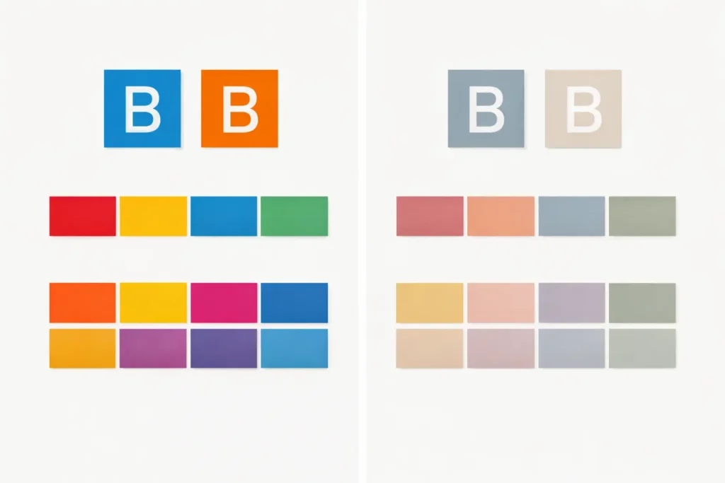
Brands use chroma to control attention.
High chroma colors stand out fast.
They work well for logos and ads.
Low chroma colors feel calm and mature.
They work well for luxury brands.
Changing chroma can change the feeling of a brand without changing the hue.
Visual Guide Ideas
Add images that show:
• high vs low chroma color swatches
• bright vs muted clothing
• bright vs muted room
• chroma vs saturation comparison
Use the keyword once in:
• first image alt text
• one file name
• one caption
Images help readers understand chroma faster.
Common Mistakes
Many people think chroma means brightness.
That is not correct.
A color can be dark and still have high chroma.
A color can be light and still have low chroma.
Chroma is about color strength, not light or dark.
Quick Recap
Chroma means color strength.
High chroma equals bold color.
Low chroma equals muted color.
It helps in art, fashion, design, painting, and photography.
Not Sure Which Color Season You Are?
Take our free 2-minute Color Season Quiz to discover whether you are most likely a Spring, Summer, Autumn, or Winter—and explore the colors that suit you best.
Conclusion
From years of working with color in styling and design, one lesson stands out. People gain confidence with color once they notice how strong or muted a color looks. Chroma plays a big role in that shift. It explains why some outfits feel bold and others feel calm. It explains why certain paint colors feel easy to live with, and others feel too strong. When you start spotting chroma in daily life, color choices become easier and more natural.
With practice, you begin to see patterns. Bright colors stand out more in small accents. Softer colors work better in larger areas. Understanding this helps you choose colors with purpose instead of guessing. The more you apply this idea, the clearer color decisions become. Over time, you build a strong eye for color and can use chroma with confidence in clothing, design, and everyday spaces.
