

Have you ever bought a piece of clothing that looked beautiful in the store but strange when you wore it? Many people with the Deep Winter color season experience this. A color may look stylish on the hanger, but once it is on your body, your skin can look dull, pale, or tired. This often happens with warm shades like camel, peach, or mustard. These colors are popular in stores, but they do not match the cool and deep features of a Deep Winter.
From studying seasonal color palettes and reviewing many Deep Winter wardrobe examples, one thing becomes clear. People in this season have cool undertones, deep coloring, and strong contrast, so they need colors that support that balance. When the wrong colors are worn, the natural brightness of the face can fade. In this guide, you will learn the worst colors for Deep Winter, why they clash with this season, and how to recognize them before choosing clothes, makeup, or accessories.
Features – Dark & Cool
Deep Winter people have cool and deep features. Their natural coloring has a strong contrast.
Eyes
Common eye colors include:
- dark brown
- black brown
- cool hazel
- deep blue
The eyes often look rich and clear.
Hair
Hair is usually dark.
Common shades include:
- black
- dark brown
- cool ash brown
Warm golden tones usually do not appear in this season.
Skin
Skin tone can vary, but the undertone is cool or neutral cool.
Skin may appear:
- porcelain
- olive
- medium cool
- deep cool
Warm undertones are uncommon.
Contrast
Deep Winter has a strong contrast.
Example:
- dark hair with light skin
- dark eyes with cool skin
This contrast means pale or dusty colors can wash out the face.
Color Dimensions
Every color season follows three main color traits.
Deep Winter colors are:
- cool
- deep
- clear
When a color breaks these traits, it often looks dull or uneven.
Colors that often clash with Deep Winter are:
- warm colors
- light pastel colors
- muted or dusty colors
These tones remove the natural contrast of the face.
Color Palette
The Deep Winter palette contains rich and cool colors. These colors look strong and clear.
Best Colors
Some good examples include:
- emerald green
- sapphire blue
- ruby red
- deep plum
- charcoal
- black
- icy pink
These colors match the natural depth of the deep winter season.
Worst Colors
Some colors can make Deep Winter look dull.
Common examples include:
- camel
- mustard
- peach
- coral
- rust
- warm beige
- olive
These shades are warm or muted. They clash with cool undertones.
Why Pastel Colors Look Bad on Deep Winter
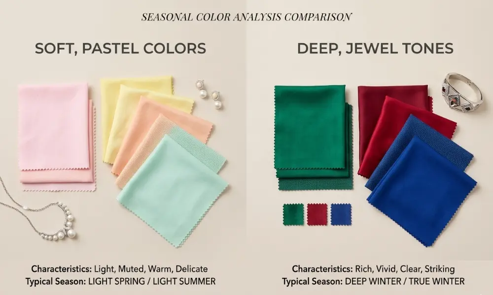
Pastel colors are very light and soft.
Deep Winter features are deep and high contrast. Because of this contrast, very light colors can look weak against the face.
Pastel colors may cause the skin to look:
- pale
- tired
- dull
Pastel shades that often clash include:
- baby pink
- pastel yellow
- light peach
- soft mint
Deeper jewel tones usually look much stronger on Deep Winter.
Examples include emerald, ruby, and sapphire.
Metals & Accessories

Jewelry color also matters.
Warm metals can look heavy or dull on Deep Winter.
Metals to avoid:
- yellow gold
- antique gold
- bronze
Better choices include:
- silver
- platinum
- white gold
Cool metals reflect the natural undertone of this season.
Color Combinations
The way colors mix in an outfit also matters.
Some combinations look strong. Others look dull.
Good combinations include:
- black and ruby red
- emerald and charcoal
- navy and icy pink
These keep the contrast strong.
Bad combinations include:
- camel and brown
- mustard and olive
- peach and beige
These mixes look too warm or soft.
Bad Colors vs Better Alternatives for Deep Winter
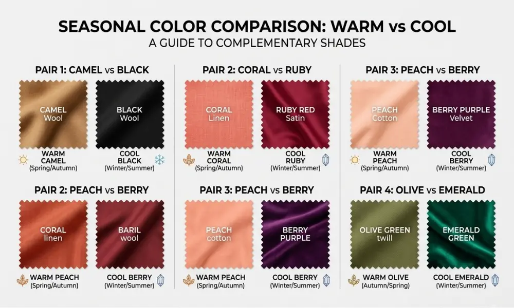
Sometimes it is easier to replace a bad color with a better one.
Here are a few simple swaps.
Bad color → Better option
- camel → black
- coral → ruby red
- peach → berry pink
- olive → emerald green
- warm beige → charcoal
These swaps keep the cool and deep look that suits Deep Winter best.
Color Comparison for Deep Winter
| Colors to Avoid | Better Alternatives |
|---|---|
| Camel | Black |
| Coral | Ruby Red |
| Peach | Berry Pink |
| Olive | Emerald Green |
| Warm Beige | Charcoal |
Deep Winter
Deep Winter color season sits between two other seasons.
These are:
Deep Winter shares depth with Deep Autumn but keeps a cool undertone.
Because of this, warm autumn colors often look wrong.
Examples include:
- rust
- mustard
- warm brown
These shades add warmth that does not match Deep Winter skin.
Deep Winter vs Deep Autumn Colors to Avoid
Deep Winter and Deep Autumn both have deep coloring. Because of this, people often confuse these two seasons.
The main difference is temperature.
Deep Winter colors are cool.
Deep Autumn colors are warm.
Warm autumn shades can clash with Deep Winter skin.
Examples of Deep Autumn colors that may look wrong include:
- rust
- mustard
- olive green
- warm camel
Deep Winter usually looks better in cool versions of these colors.
For example:
- Emerald instead of olive
- Ruby instead of rust
Colors to Avoid for Deep Winter
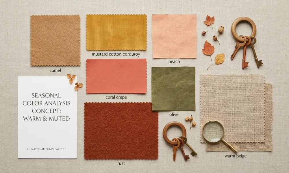
Some color groups often clash with this season.
Warm Colors
Warm shades create an imbalance with cool undertones.
Examples:
- peach
- coral
- apricot
These colors can make the skin look red or tired.
Earthy Tones
Earthy colors belong more to autumn palettes.
Examples:
- camel
- mustard
- rust
These tones look too warm and heavy.
Muted Colors
Soft dusty colors remove the strong contrast of Deep Winter.
Examples:
- dusty pink
- taupe
- olive
Muted colors can make the face appear dull.
Can Deep Winter Wear Beige or Brown?
Many Deep Winter readers ask if they can wear beige or brown.
Most beige shades are warm. Warm beige often contains yellow or golden tones. These tones can clash with the cool undertone of Deep Winter skin.
Brown can also be tricky. Warm brown shades usually belong to autumn palettes.
Examples of brown shades that may clash:
- camel
- golden brown
- warm chocolate brown
Cooler browns work better.
Examples include:
- espresso
- dark cocoa
- cool deep brown
When in doubt, darker and cooler neutrals usually look better on Deep Winter.
Common Color Mistakes Deep Winters Make
Many Deep Winter people choose colors that seem dark but still clash with their cool undertone.
Here are some common mistakes.
Choosing warm burgundy
Some burgundy shades have brown or warm tones. These can look dull on Deep Winter skin. A cool wine or berry shade works better.
Buying camel coats
Camel is a warm neutral. It often makes Deep Winter skin look tired. Black or charcoal coats usually look better.
Using peach blush
Peach blush is warm. It can clash with cool undertones. Berry or cool pink blush looks more natural.
Choosing warm brown hair dye
Warm brown hair colors often contain golden tones. These can look unnatural on Deep Winter features.
Makeup Colors Deep Winter Should Avoid
Makeup colors also follow the same color rules. Warm shades often clash with this season.
Lipstick colors to avoid
- coral
- orange red
- warm tomato red
Blush colors to avoid
- peach
- apricot
- warm coral
Eyeshadow colors to avoid
- copper
- warm bronze
- golden brown
Cool tones like berry, plum, and blue-based red usually look better.
Hair Colors Deep Winter Should Avoid
Hair color can change how the whole face looks.
Warm shades often clash with the cool undertone of Deep Winter.
Hair colors to avoid include
- copper
- golden brown
- warm caramel
- honey blonde
These colors add warmth that does not match the natural coloring of this season.
Cool dark shades usually work better.
Examples include
- black
- cool dark brown
- ash brown
How to Spot Bad Colors While Shopping
Shopping can be confusing because many clothes use warm tones.
Some color names often signal warm shades.
Be careful with labels like
- warm beige
- golden brown
- caramel
- peachy
- sun kissed
These names often mean the color contains warm pigment.
Deep Winter usually looks better in colors labeled
- cool
- deep
- jewel tone
Simple Deep Winter Color Rule
A simple rule can help when choosing colors.
Deep Winter colors are usually:
- cool
- deep
- clear
Colors that often clash with this season are:
- warm
- dusty
- pale
If a color looks warm, soft, or faded, it may not suit Deep Winter.
If a color looks rich, cool, and clear, it is more likely to work well.
Quick List of Colors Deep Winter Should Avoid
Here is a simple list for quick reference.
Deep Winter should often avoid
- camel
- mustard
- peach
- coral
- rust
- warm beige
- dusty pink
- olive
These colors are warm, soft, or muted. They can reduce the natural contrast of Deep Winter features.
Conclusion
Choosing the right colors can change how your skin, eyes, and hair look together. Deep Winter features usually appear strongest in cool, deep, and clear colors, while warm or dusty shades often weaken that natural contrast. Colors like camel, peach, coral, mustard, and warm beige may seem attractive in stores, but they often clash with the cool undertones of this season. From studying many seasonal color palettes and real wardrobe examples, a simple pattern appears. If a color looks warm, pale, or faded, it often does not suit Deep Winter. If it looks cool, rich, and clear, it usually works much better. Keeping this rule in mind can make shopping easier and help build a wardrobe that feels balanced and flattering.
