

For a long time, I bought clothes that looked great in store but wrong on me at home. Bright tops made my face look dull. Black felt too harsh. Some lipsticks looked heavy even with light makeup. I kept thinking I picked the wrong items, but the real issue was color. Many soft autumn readers face this same problem. You try to follow trends, yet something always feels off. You end up with pieces you never wear and shades that drain your face.
After working with many people who fall into the soft autumn group, I have seen this pattern again and again. Once we remove the worst colors for soft autumn, everything starts to make sense. Skin looks clearer. Outfits feel balanced. Makeup blends better. This guide comes from real styling work and years of testing colors in daily life. If you have ever felt that certain shades make you look tired or washed out, this will help you spot them and avoid them.
Soft Autumn Quick Takeaway
- Avoid bright, cool, and very dark colors
- Skip pure black and pure white near the face
- Choose warm, soft, muted tones
- Best neutrals: cream, olive, soft navy
- If a color looks too strong in daylight, it is likely not right
Soft Autumn Basics
Soft autumn colors are warm, soft, and muted.
They are never very bright. They are never very cool.
They feel calm and earthy.
Soft autumn looks best in:
- warm tones
- muted shades
- low contrast
Anything too bright, too cool, or too dark can clash.
Worst Colors for Soft Autumn
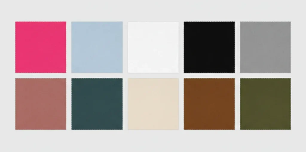
Bright Colors
Very bright colors are too strong.
Avoid:
- neon pink
- bright orange
- electric blue
- bright purple
- hot magenta
These shades overpower soft autumn features and make skin look dull.
Wear instead:
- dusty rose
- soft coral
- warm peach
- muted teal
Cool Colors
Soft autumn needs warmth. Cool tones fight that warmth.
Avoid:
- icy blue
- cool pink
- blue-based red
- lavender
- cool gray
These shades can make skin look pale or gray.
Wear instead:
- warm rose
- warm taupe
- soft olive
- muted aqua
Very Dark Colors
Dark shades can feel too heavy.
Avoid:
- jet black
- deep charcoal
- very dark navy
- deep plum
They create too much contrast.
Wear instead:
- soft brown
- warm charcoal
- muted navy
- cocoa
Stark Light Colors
Very light sharp shades can wash you out.
Avoid:
- pure white
- icy pastels
- very bright cream
Wear instead:
- cream
- warm ivory
- soft beige
Best Color Swaps for Soft Autumn
| Avoid This | Try This Instead |
|---|---|
| Jet black | Soft brown |
| Pure white | Cream |
| Neon pink | Dusty rose |
| Electric blue | Muted teal |
| Cool gray | Warm taupe |
| Blue red | Soft brick |
| Icy pastels | Warm muted tones |
Here you can find the best soft autumn colors in detail.
Why Some Colors Look Bad on Soft Autumn
Soft autumn features are warm and soft.
They do not have a strong contrast.
Colors look wrong when they are:
- too bright
- too cool
- too dark
- too stark
Bright shades overpower your face.
Cool shades remove warmth.
Very dark shades create harsh contrast.
Stark light shades wash you out.
This is why certain colors feel off even if you like them.
Can Soft Autumn Wear Black?
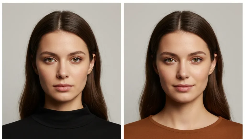
Black is usually too harsh.
It creates strong contrast and can make skin look dull.
If you want to wear black:
- keep it away from your face
- mix it with warm tones
- choose softer fabrics
Better options:
- dark brown
- olive
- warm charcoal
Can Soft Autumn Wear White?
Pure white is too sharp.
It can make skin look flat.
Better choices:
- cream
- soft ivory
- warm beige
Best Neutrals for Soft Autumn
The wrong neutrals can ruin an outfit.
Avoid:
- jet black
- pure white
- cool gray
- icy beige
Better neutrals:
- warm brown
- olive
- soft navy
- cream
- warm taupe
- camel
Shoes and bags look best in:
- tan
- warm brown
- muted gold
- soft olive
Soft Autumn Neutral Guide
Best Neutrals
- Cream
- Warm beige
- Camel
- Olive
- Warm navy
- Cocoa
- Soft brown
Neutrals to Avoid
- Jet black
- Pure white
- Cool gray
- Icy beige
Worst Makeup Colors for Soft Autumn
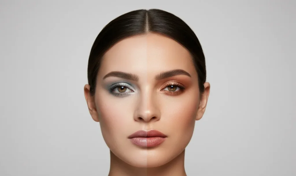
Lipstick
Avoid:
- cool pink
- blue-red
- neon coral
- deep wine
Better choices:
- warm rose
- soft terracotta
- muted peach
Blush
Avoid:
- bright pink
- cool berry
- icy rose
Better choices:
- warm peach
- soft apricot
- muted coral
Eyeshadow
Avoid:
- icy silver
- cool gray
- bright purple
Better choices:
- bronze
- warm taupe
- olive
- soft brown
Worst Hair Colors for Soft Autumn
Hair that is too cool or too dark can clash.
Avoid:
- blue black
- ash blonde
- platinum
- very dark burgundy
Better choices:
- warm brown
- soft auburn
- golden brown
- caramel highlights
Real Outfit Mistakes to Avoid
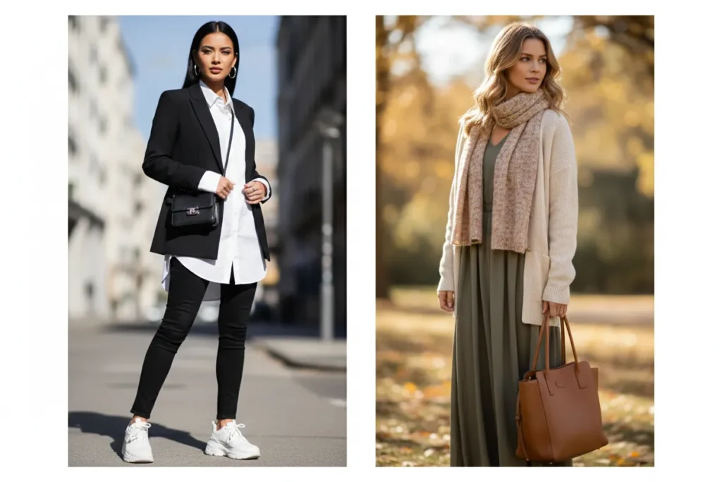
Work Outfits
A black blazer with a white shirt can feel harsh.
Try a warm brown blazer with a cream top instead.
Casual Outfits
Neon tops or very bright prints overpower your look.
Muted warm tones feel balanced.
Formal Wear
Jet black dresses can look too heavy.
Deep brown or bronze feels better.
Everyday Styling
High contrast outfits often look too strong.
Soft autumn looks best in blended tones.
Soft Autumn vs Soft Summer
These seasons are often confused.
Both are muted.
But soft autumn is warm.
Soft summer is cool.
Soft autumn:
- warm
- earthy
- golden
Soft summer:
- cool
- dusty
- gray toned
If warm muted shades look better, you are likely soft autumn.
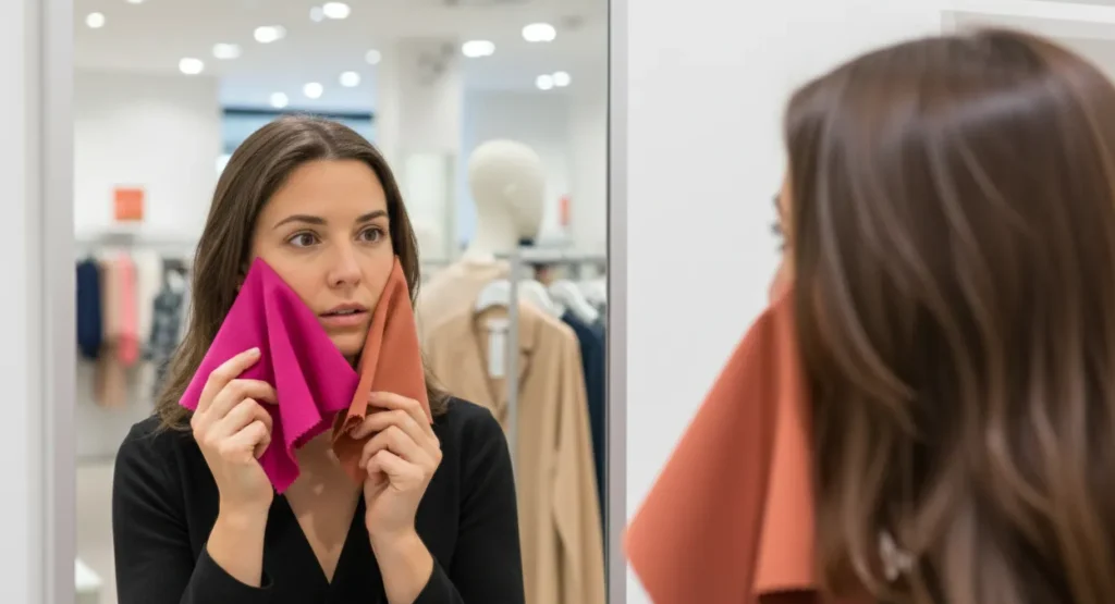
How to Tell if a Color Works
Hold the color near your face in natural light.
If your skin looks gray, the color is too cool.
If your features fade, it is too bright.
If your face looks clear, the color works.
How to Shop for the Right Colors
When shopping:
- check colors in natural light
- hold fabric near your face
- avoid very bright shades
- avoid cool undertones
- choose warm muted tones
If a color feels too strong, skip it.
Quick Reference: Worst Colors for Soft Autumn
Avoid:
- neon pink
- electric blue
- icy lavender
- pure white
- jet black
- cool gray
- blue red
- bright magenta
- icy pastels
Choose instead:
- warm rose
- olive
- soft teal
- cream
- warm brown
- muted coral
Soft Autumn Shopping Checklist
- Check colors in natural daylight
- Hold the fabric near your face
- Avoid very bright or neon shades
- Look for warm, muted tones
- If the color feels harsh, skip it
Conclusion
Over time, I have learned that soft autumn style becomes simple once the wrong colors are gone. When you wear warm, soft, muted shades, your face looks calm and healthy. When colors are too bright or too cool, the whole look feels off, even if the outfit is trendy. Many readers tell me they feel more confident after they stop wearing the harsh shades that never worked for them.
You do not need a large wardrobe to look put together. You just need colors that match your natural warmth and softness. Use this guide when you shop, plan outfits, or choose makeup. With practice, you will spot the right shades faster and avoid the ones that clash. That clarity builds confidence and helps you create a wardrobe that always feels right.
